Since v1.6.0, this module is part of Advanced Layout Module.
This module allows you to set the height, width, min-height, max-height min-width and max-width CSS properties for blocks. They are responsive and useful for responsive design.
This module currently supports the following core blocks.
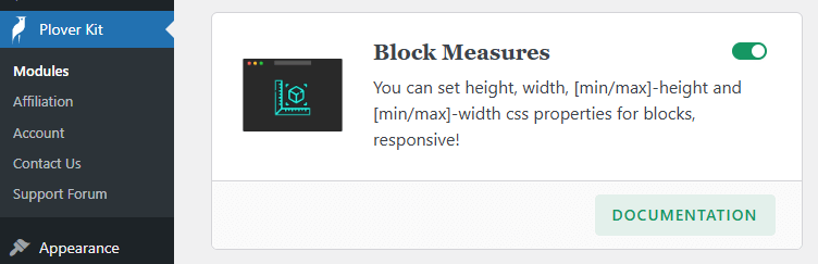
You can enable this module via “WordPress Dashboard -> Plover Kit -> Modules -> Block Measures“
Block Measures Panel
You can find the Plover: Measures panel in the sidebar of supported blocks.
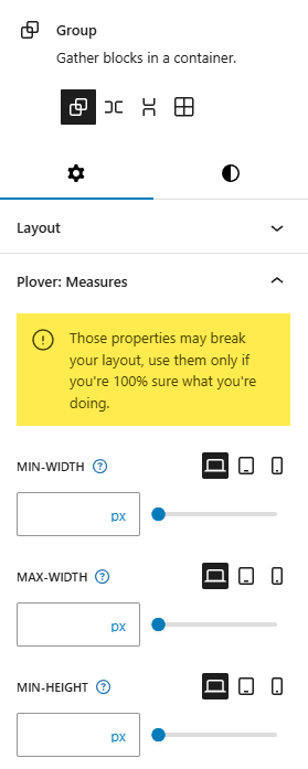
Options Overview
Min-Width
The min-width CSS property sets the minimum width of an element. It prevents the used value of the width property from becoming smaller than the value specified for min-width.
Max-Width
The max-width CSS property sets the maximum width of an element. It prevents the used value of the width property from becoming larger than the value specified by max-width.
Min-Height
The min-height CSS property sets the minimum height of an element. It prevents the used value of the height property from becoming smaller than the value specified for min-height.
Max-Height
The max-height CSS property sets the maximum height of an element. It prevents the used value of the height property from becoming larger than the value specified for max-height.
Width
The width CSS property sets an element’s width. By default, it sets the width of the content area, but if box-sizing is set to border-box, it sets the width of the border area.
Height
The height CSS property specifies the height of an element. By default, the property defines the height of the content area. If box-sizing is set to border-box, however, it instead determines the height of the border area.
Work With CSS Display
CSS Display is the perfect partner with this module. For example, setting Overflow Y to scroll for a Group Block with a fixed height can creates a scrollable block. This is helpful if you need to hide a lot of content in page.
You can also utilize your talents to discover more uses for this module.
Leave a Reply