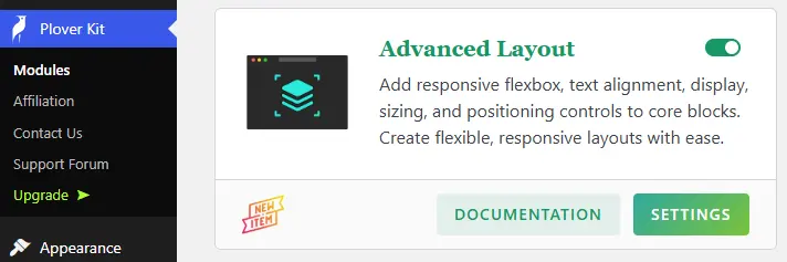
The Advanced Layout module add responsive flexbox, text alignment, display, sizing, and positioning controls to core WordPress blocks. Create flexible, responsive layouts within the WordPress Block Editor with ease.
You can enable this module via “WordPress Dashboard -> Plover Kit -> Modules -> Advanced Layout”
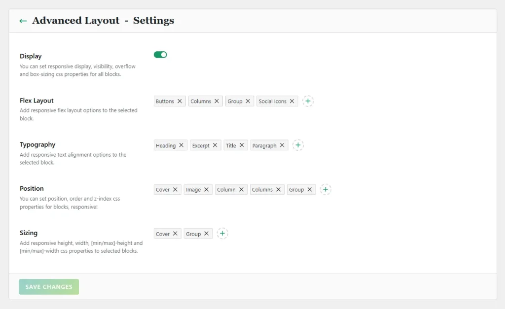
Module Settings
When you click the settings button on the Advanced Layout module card, you enter the module’s options page. You can find more details about the Plover Kit plugin dashboard settings in the Plover Kit Dashboard overview.
In the Advanced Layout module, we provide the following advanced responsive layout tools to help you create flexible, responsive layouts with ease:
- Display: If this option is enabled, all blocks will have a “Plover: Display” panel where you can configure their visibility, overflow, and box sizing attributes on different devices.
- Flex Layout: Add responsive flex layout options to the selected block.
- Typography: Add responsive text alignment options to the selected block.
- Position: You can set position, order and z-index css properties for selected blocks on different devices.
- Sizing: Add responsive height, width, [min/max]-height and [min/max]-width css properties to selected blocks.
You can learn how to use the Blocks Selector Control here.
Flex Layout Panel
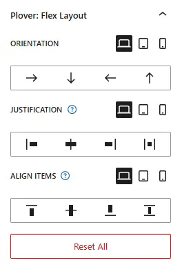
When you select a block that supports Flex Layout in the editor, you’ll find the “Plover: Flex Layout” panel in the block settings sidebar.
It offers three responsive options that let you control how content is arranged within the container and how it’s aligned horizontally and vertically. It completely addresses the shortcomings of WordPress’s default layout blocks in terms of responsiveness.
- Orientation: This option defines how blocks are arranged within a container block; in addition to the common horizontal and vertical arrangements, it also offers a reversed layout.
- Justification: This option defines how blocks within a container block are aligned horizontally.
- Align Items: This option defines how blocks within a container block are aligned vertically.
Alignment Panel
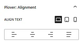
This option is primarily used for text input blocks, such as WordPress core Paragraph and Heading block. It allows you to set the text alignment in a responsive manner.
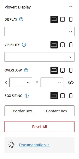
Display Panel
When you select a block, you’ll find the “Plover: Display” panel in the block settings sidebar. Let’s take a closer look at each option on this panel:
Display
The display CSS property sets whether an element is treated as a block or inline box and the layout used for its children.
A common use case is to set Display to none in order to display or hide content on different devices, which is a common requirement in responsive design.
There are currently 6 options.
Visibility (Premium)
The visibility CSS property shows or hides an element without changing the layout of a document.
Overflow (Premium)
The overflow CSS property sets the desired behavior when content does not fit in the element’s padding box (overflows) in the horizontal and/or vertical direction.
Box Sizing (Premium)
The box-sizing CSS property sets how the total width and height of an element is calculated.
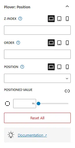
Position Panel
When you select a block that support position, you’ll find the “Plover: Position” panel in the block settings sidebar. Let’s take a closer look at each option on this panel:
Z-Index
The z-index CSS property sets the z-order of a positioned element and its descendants or flex and grid items. Overlapping elements with a larger z-index cover those with a smaller one.
Order
The order CSS property sets the order to lay out an item in a flex or grid container. Items in a container are sorted by ascending order value and then by their source code order. Items not given an explicit order value are assigned the default value of 0.
Position
The position CSS property sets how an element is positioned in a document. There are currently 5 options.
You can try out how each type of options affects the position of an element here.
Positioned Value
The top, right, bottom, and left properties determine the final location of positioned elements.
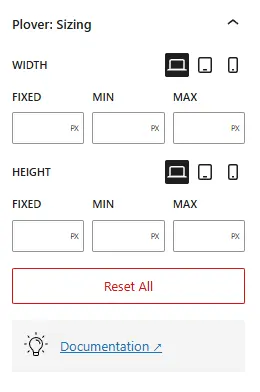
Sizing Panel
This feature is only available in the premium version, if you are using the free version, please upgrade.
This panel provides responsive controls for setting height, width, [min/max]-height and [min/max]-width css properties to selected blocks.
Options Overview:
Width
The width CSS property sets an element’s width. By default, it sets the width of the content area, but if box-sizing is set to border-box, it sets the width of the border area.
Min-Width
The min-width CSS property sets the minimum width of an element. It prevents the used value of the width property from becoming smaller than the value specified for min-width.
Max-Width
The max-width CSS property sets the maximum width of an element. It prevents the used value of the width property from becoming larger than the value specified by max-width.
Height
The height CSS property specifies the height of an element. By default, the property defines the height of the content area. If box-sizing is set to border-box, however, it instead determines the height of the border area.
Min-Height
The min-height CSS property sets the minimum height of an element. It prevents the used value of the height property from becoming smaller than the value specified for min-height.
Max-Height
The max-height CSS property sets the maximum height of an element. It prevents the used value of the height property from becoming larger than the value specified for max-height.
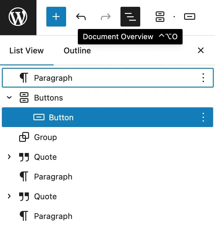
Select Invisible or Positioned Blocks
If you change a block’s position property or set a block’s “display” property to “None,” the block will become unselectable in WordPress block editor. In this case, you can use the WordPress Block Editor’s Document Overview menu to select the invisible block.
Leave a Reply