The Plover Kit dashboard is the central interface for managing all modules. Here you can enable/disable modules, access module documentation, configure module options, and quickly navigate to forums, documentation, upgrade pages, etc., via the sidebar. This document will guide you through the various functional areas of the dashboard.
Dashboard Layout
The dashboard is divided into three main areas: the top toolbar, the sidebar, and the central modules area.
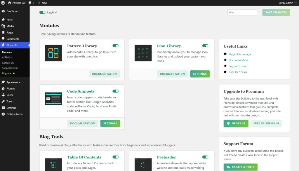
Top Toolbar Area
The top toolbar contains three key controls:
- Global Toggle:Enable or disable all modules with one click. Useful for quick batch operations.
- Search Box:Type keywords to filter displayed modules in real time, helping you quickly locate a specific module.
- Save Button:After manually enabling/disabling modules, you must click this button to save the changes to the system. Changes will not take effect if you forget to save.
Sidebar Area
The sidebar provides quick access to common resources:
- Plugin Forum:Go to the official support forum to communicate with other users or seek help.
- Documentation:Access the complete plugin documentation for detailed instructions.
- Upgrade:Learn about and upgrade to the pro version for more features and dedicated support.
- …
Modules Area
Each module is displayed as a card, containing the following elements:
- Module name and short description:Indicates the function and purpose of the module.
- Toggle Button:Used to enable or disable the module. Once enabled, the module functions immediately (must be saved with the top save button).
- Documentation Link:Click to open the detailed documentation page for the module to learn how to use it.
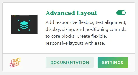
- Settings Button (some modules):If the module has configurable options, this button appears. Click to enter the module-specific settings interface.
Module Settings Interface
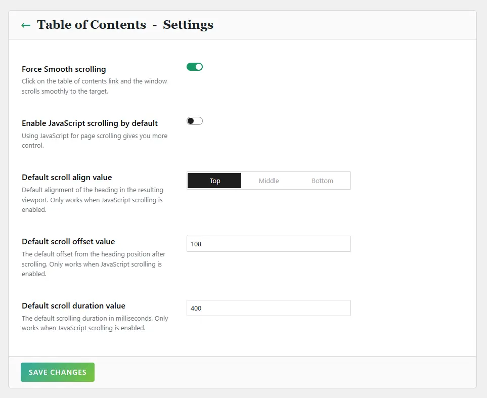
When you click the settings button on a module card, you enter the module’s options page. Each module’s settings interface follows a consistent structure:
Some specific modules, such as Code Snippets, Icon Library, and Preloader, have dedicated configuration interfaces. You can find more details in the module’s documentation.
- Top:Displays the current module title and a “Back” button that returns you to the main dashboard.
- Settings Area:Contains various configurable options for the module, such as text inputs, select, etc.
- Bottom:Has a “Save Changes” button. Any changes made on this page must be saved by clicking this button to take effect.
Blocks Selector Control
In the settings interface for certain modules, such as Advanced Layout and Block Shadow, you will see the “Block Selector” control.
The Blocks Selector allows you to choose which WordPress blocks the module’s functionality applies to. It consists of two parts: the “Selected Blocks Tag Cloud” at the top and the “Block Selector Panel” that appears when you click the plus button next to the block tags.
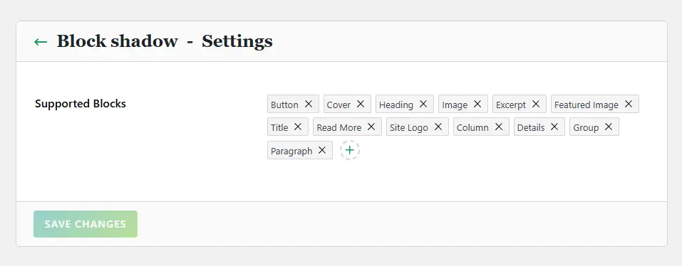
- Default View:Selected blocks are displayed as a “tag cloud.” Each block name is a tag, and there is an “x” on the right side of the tag. Clicking it removes the block from the selection.
- Adding New Blocks:At the end of the tag cloud, there is a button with a plus icon. Clicking it opens the Block Selector panel.
Block Selector Panel
The panel lists all available WordPress blocks, grouped by block namespace (e.g., “Core Blocks,” “WooCommerce,” “Plover Blocks,” etc.).
Each group is collapsed by default. Click the group name to expand and see all blocks under that group.
Each block has a checkbox before its name. Check the box to add the block to the selection; uncheck to remove it.
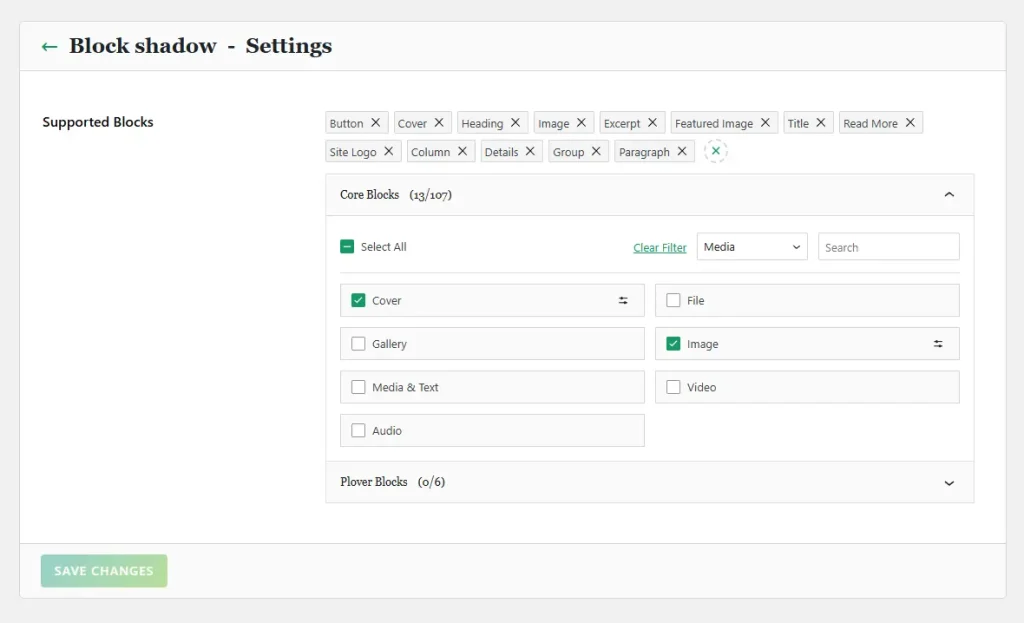
On the top of the blocks, there are several quick-action options:
- A “Select All” checkbox to quickly check or uncheck all blocks in that group.
- A dropdown menu that lets you display only blocks from a specific category.
- A search box that filters displayed blocks in real time by keyword.
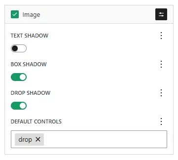
Additional Block Configuration
Some modules allow more detailed settings for individual blocks. If a block supports additional configuration, a settings button will appear to the right of its name. Clicking it expands a configuration area below the block name, where you can adjust block-specific parameters.
Save Changes
Don’t forget that all changes made in the settings interface (including Blocks Selector selections) must be saved by clicking the Save Changes button at the bottom of the page.
Important Notes
- The Save button is crucial:Any changes to module enable/disable and module settings must be saved by clicking the “Save Changes” button to take effect permanently.
- Documentation is always here:If you have questions about a module, please read the documentation before giving up.
Leave a Reply