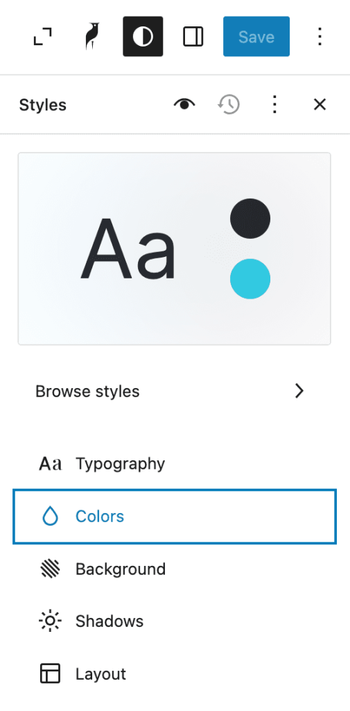
The Plover theme provide 8 preset colors, allowing you to effortlessly customize every part of your website. The primary color and its active state establish the core visual identity — used for elements like link hover effects and key interactive components. Meanwhile, a neutral color gradient from 0 to 950 provides flexible options for text, backgrounds, borders, and more, helping you create a balanced and professional design with ease.
Dark mode color rules
In dark mode, colors are inverted, and here are the exact rules:
| Color in Light | Color in Dark | |
|---|---|---|
| Primary / Active | -> | Primary |
| Primary | -> | Primary / Active |
| Neutral / 950 | -> | Neutral / 0 |
| Neutral / 800 | -> | Neutral / 200 |
| Neutral / 600 | -> | Neutral / 400 |
| Neutral / 400 | -> | Neutral / 600 |
| Neutral / 200 | -> | Neutral / 800 |
| Neutral / 0 | -> | Neutral / 950 |
Here’s a visual comparison:
Colors in light mode
Primary / Active
Primary
Neutral / 950
Neutral / 800
Neutral / 600
Neutral / 400
Neutral / 200
Neutral / 0
Colors in dark mode
Primary / Active
Primary
Neutral / 950
Neutral / 800
Neutral / 600
Neutral / 400
Neutral / 200
Neutral / 0
Please keep this rule in mind when adjusting colors.
Manage color palette
Note: This section requires you to be familiar with Site Editor, if you are not, we recommend you read the following first:
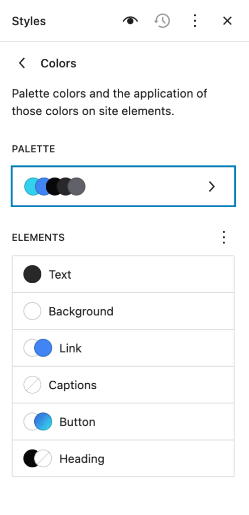
Click the Colors section in the Style sidebar.
Then select the palette section.
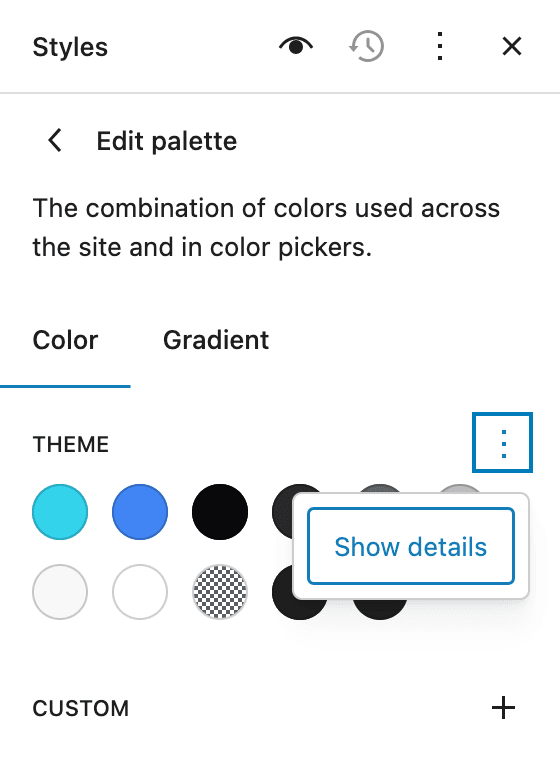
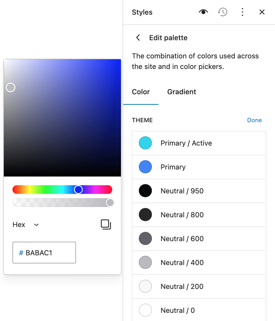
Click the three dots behind the “theme” title and select the Show Details option from the menu.
You can make changes to the color by clicking on the color indicator, which will be applied to the entire site.
Leave a Reply